Hello Guest User, You are visiting this website from a computer with an IP address of 172.70.126.198 with the name of '?' since Sat Apr 20, 2024 at 10:17:32 AM PT for approx. 0 minutes now.
The KRO Gold Resource Center allows quick lookup of key charts we have created to illustrate aspects of gold and the gold company sector we think are important. The best place for free real time and historical gold and other precious metals related information is Kitco. The comments underneath some of our charts are of a general nature and are updated only when necessary to reflect major changes in our view about gold. We are not interested in topics such as gold price manipulation conspiracies, the reinstatement of the gold standard, anxiety about hyper-inflation or currency debasement, and ideological arguments for the wisdom of gold ownership. We see gold as playing a far smaller role in determining the course of history than it has had in the past, but we do see it as playing an important role in helping with personal wealth preservation and as a form of insurance against the uncertainties that will accompany shifts in global economic and military power balance during the next 10-15 years as the United States gradually loses its status as the sole super-power and issuer of a single reserve currency. Our main interest is the exploration and development of gold deposits, the profitability of which is a function of higher real prices for gold. We do not rule out the risk of US inflation and currency debasement, but we see any related upwards adjustment in the price of gold as unproductive for the gold resource sector. We think rising global prosperity and its relative displacement of American power as the main driver for higher, sustainable real gold prices, which in turn supports our interest in making leveraged profits in the gold exploration and development sector. We think global depressions and economic collapses would create lower real prices for gold, and be especially harmful to gold producers, developers and explorers. We offer a prosperity based gold narrative as a realist alternative to the ideologically constrained conventional gold bug narrative that allows an investor to be enthusiastic about gold without having to accept apocalyptic social and economic outcomes as the flip side of higher gold prices, and sidestep the political discussion about how the world and people's lives should be organized.
Physical vs Paper Gold
There is considerable discussion about the merits of physical versus paper gold with paper gold understood as futures contracts, options and exchange-traded products such as the SPDR Gold Trust (GLD-NYSE). There is, however, another class of paper gold in the form of unallocated gold where a bank has physical possession of only a fraction of the physical gold that its clients have on deposit. These banks sell to their clients "gold" which in some cases they can ask delivery of, but in most cases they only have the right to sell the gold through the bank at the spot price. This is not a big deal for investors looking for a trade in gold, but it is problematic for those looking to park some of their wealth in gold because during crunch time if gold should happen to soar the bank will fail because it likely parked the capital it got from selling gold "short" to the client in other financial instruments which subsequently flash-evaporated. Unless the gold ownership is just a naked bet on the direction of gold nobody should ever buy unallocated gold from a financial institution
.We think gold should be treated as a long term, portable hedge against wealth evaporation events such as title expropriations, systemic financial failures, and catastrophes affecting personal assets. To accomplish that goal there is no option other than to own physical gold, either in a storage location one controls or through an "allocated gold" account subject to an audit system. We do not see physical gold ownership as a hedge against inflation a particularly smart strategy if you live in the United States unless you expect the political system to collapse and taxes become uncollectible or you are prepared to break the law by not paying the high collectible capital gains tax applied to gold, which for California residents translates into a 38% tax on gains. In other words, owning gold to protect against the erosion of the purchasing power of your wealth by inflation is only partial protection. Although gold yields no return, the finite nature of the existing above ground gold stock and the high real cost of mining new gold guarantees that gold will hold its "intrinsic value" understood as its replacement cost. That may go down in monetary terms in the event of deflation, but not in real terms. Gold should not be understood as a safe haven in the sense that its monetary value is stable; it is a safe haven in the sense of being an asset class whose intrinsic value to its owner cannot be wiped out in the manner of financial and real property assets except when it is taken at the point of a gun. We do think it is unwise to own gold through a financial institution which does not physically allocate and segregate the gold you own. It is much better to store the gold in a vault or safety deposit box to which only you have access. Profit minded investors who are not interested in using gold to park wealth for the long term should look to paper gold as the vehicle to make trading profits, though there are many other instruments that lend themselves to volatility trading. We are not interested in trading gold, nor its short term fluctuations, so we do not have much to say about the futures market.
We do think the SPDR ETF is a good way to indirectly own physical gold, but only if you believe the legal and social institutions of the United States are stable. The gold allocated to your SPDR ETF unit does erode over time due to the ETF's management fee leakage, equivalent to storage costs if you stash your gold in a secure vault rather than a hole in your backyard or under your floorboards. We think the SPDR gold ETF is particularly suitable for owning inside retirement accounts where one is inclined to hold it for the long term and where inflation related price gains are not subject to the collectible capital gains tax. We do not believe the conspiracy allegations that the SPDR ETF is a fraud that does not have physical gold allocated to the issued paper units which represent just under a tenth of an ounce of gold. The ETF was designed at the behest of the World Gold Council, a gold mining industry lobby group, to create a form of gold better suited for investment demand. While physical gold demand is strong in developing nations, residents of developed nations who do not spend much time fretting about an imminent apocalypse that would wipe out their assets are much less inclined to bother with the headache of buying and storing an amount of gold that represents a meaningful chunk of one's net worth. The WGC intended the SPDR ETF to make it very easy for investors to buy and hold a meaningful amount of gold indirectly, thereby boosting aggregate investment demand for new mine supply. The trouble is that GLD is also very easy to sell, which turned it into a favorite for gold trading strategies deployed by retail investors, hedge funds and algo traders. Because shorting is allowed at times there will exist more GLD shares than issued and backed by allocated physical gold. However, the SPDR Gold Trust has a very sophisticated mechanism outlined in its Prospectus which allows a designated group of bullion bankers to deliver physical gold to the ETF in exchange for paper GLD units to cover their paper short position, or put GLD units to the trust and receive physical gold. The bullion bankers act as an arbitrage mechanism between the physical bullion market and the GLD paper market which forces the GLD paper market to closely track the physical gold market. Because the GLD is traded electronically - no delivery of GLD paper is possible - its popularity has soared to the extent that at times its market activity drove the physical gold price during NYSE trading hours. The gold ETF's have been blamed for the market's abandonment of gold producers as a paper proxy for physical gold, for which they should be congratulated. A gold producer should be valued on the projected profitability and longevity of its gold production, which involves many more factors than the price of gold. We think the gold ETFs have made a positive contribution to the gold sector, but we also have to accept the other side of the coin.
The downside of the gold ETFs is that they attract momentum traders at the hedge fund scale, which was fine while the narrative was dominated by the apocalyptic gold bugs with their predictions of imminent hyper-inflation and currency debasement caused by Federal Reserve money-printing efforts to keep the US economy afloat, but when signs emerge that the US economy was finally improving, the US deficit was at least temporarily declining, and Bernanke introduced the concept of "tapering" for his quantitative easing program, profligate governments, the dominant gold narrative was turned upon itself. That set the stage for a massive bear raid on the gold market triggered on April 12, 2013 through a large sale of gold through COMEX. Suddenly the hedge funds expecting gold to soar through $2,000 were hearing predictions of $1,000 from investment bankers who had built up large short positions ahead of the gold smackdown. It is arguable that the mass exodus from GLD by hedge funds led the price of gold down, because a recent peak on December 7, 2012 until August 8, 2013 GLD lost 14,275,630 ounces as the bullion bankers put GLD paper they bought in the market from the hedge funds to the SPDR Gold Trust in exchange for physical gold. During this period the SPDR Gold Trust lost 32.8% of its gold, what one might call the Great Extraction. Since August 8, 2013 SPDR has been acquiring gold again, a sign that investors are once again buying gold because they see an uptrend back in place.
Misunderstandings about the Relationship between Gold, the US dollar and other Metals
The price of gold is commonly described as being inversely related to the status of the US dollar against other currencies. This is only true in the sense that gold trends up when the US dollar is down and vice versa. What is not true is the suggestion that much of the increase in the price of gold since the $252.85 per oz low on February 20, 2001 reflects the decline of the US dollar against other currencies. To see how the US dollar and gold compare we normalized both to 100 based on their respective values on February 20, 2001 and used that as the base to plot their recalculated values in the chart above. Between then and early 2009 the Major USD Index declined at a much lower rate than gold gained, and then went sideways while gold continued to rise such that as of August 28, 2013 gold had increased 454% from its bottom while the Major USD Index has declined only 28% from its corresponding level.
The chart above plots the percentage performance of gold as experienced in domestic currencies using the gold price and existing USD exchange rates as of January 4, 1999. The big losers have been Australia and Canada whose currencies soared against the US dollar during the past decade when the super-cycle drove demand for their commodity output.
The ratio between the gold and silver prices has been volatile since the United States revoked the convertibility of US dollars into gold at the fixed price of $35 per oz. While a stable ratio was to be expected when gold and silver both served monetary roles, this no longer applies in the modern era of fiat currencies. Gold and silver have different supply-demand dynamics, with silver predominantly supplied as a by-product of base metal mines and to some degree gold mines. This implies that the size of the above ground gold and silver stocks changes independently, which rules out using their relative abundance as the basis for a stable ratio. Gold and silver also have different usage dynamics, with most of the above ground silver stock fabricated into commercial applications and processes, while most of the gold stock is held as an investment directly in the form of coins and bullion, and indirectly in the form of jewelry which can be readily recycled as "scrap". Both also have very different potential new usage dynamics. Unlike the case with silver, the high price of gold and its "inert" nature discourage innovation with regard to new uses for gold that might dramatically affect "industrial" demand. Demand for gold will thus stay overwhelmingly in the form of "investment", whereas the demand for silver due to emerging or fading industrial usages will fluctuate unpredictably. Consequently no meaning can be assigned to whatever the ratio between the prices of gold and silver happen to be. However, due to the relatively small silver float, which is held and traded as an investment, changes in the much bigger gold market do cause the silver price to track the gold price trend on a leveraged basis so that when gold drops silver drops more, resulting in a sharply higher gold-silver price ratio, and when gold jumps, silver tends to jump proportionately more with the gold-silver ratio dropping. This whip-snapping effect allows silver producers and developers to be part of gold-trend linked trading strategies.
The prices of gold and copper are often presented as having an inverse relationship on the premise that during economic expansions rising physical demand drives up the price of copper while the corresponding decline in anxiety reduces demand for gold. The relative performance of copper and gold since January 2, 1992 when copper was at $0.52/lb and gold at $360/oz does not offer evidence of a stable inverse relationship. In fact, the prices for copper and gold appear to be positively correlated since the eruption of the commodity super-cycle in 2002, and especially so since the 2008 crash. While the price of copper is clearly linked to the combination of physical demand driven by the business cycle and the lagged supply response by miners which creates a boom-bust cycle for copper and other "non-investment" metals, the price of gold has complex drivers. During an economic downturn monetary policy generates low interest rates, which reduces the opportunity cost of holding gold, which does not generate a return in the form of interest, dividends or rent. Fiscal and monetary efforts to stimulate an economic turnaround create arguments for owning gold, so gold's price is supposed to rise during bad times. When the economy does rebound, the prospect of higher interest rates and business returns is supposed to discourage gold ownership. But economic booms are usually accompanied by a credit expansion, which is inflationary, so the price of gold should also rise along with the price of copper. The apparent twinning of the copper and gold price trends during the past decade is likely linked to emerging prosperity as a gold demand driver in cultures with sorry political histories, as well as a rising strategic demand from members of mature economies whose economic and military power is undergoing a decline relative to that of the upstart economies.
Official Sector Gold
The United States is by far the largest official sector holder of gold, followed by Germany, the IMF, France and Italy. China is in sixth place, but only occasionally reports its central bank gold holdings. Because the Chinese government is the official buyer of all domestic gold production, assuming China's central has not been a seller of gold, one can further assume that based on production figures since the last report China's official sector holdings are more than double what has been reported, higher if the official sector has also been a buyer of the physical gold imported to China in recent years rather than just its private sector. That would put China at a rank similar to Germany.
This chart shows the relative gold holdings of the official and private sector since 1945 both in absolute terms (the left y axis) and in percentage terms (the tight y axis). The United States peaked in 1940 with 75.7% of all official sector gold, which at that time represented 47.2% of the above ground gold stock as estimated by the World Gold Council. The official sector's share of the above ground stock peaked in 1959 at 49%, after which it began a steep decline until bottoming recently with its share at 18.6%. The biggest potential for higher real gold prices lies with the possibility that the central banks will accelerate net purchases of physical gold. While the "gold standard" narrative pushes for a mandated return of gold as a necessary foreign reserve holding rather than an optional one as exists today, a less ambitious reason to expect the official sector's share of the above ground gold stock to rise is a strategic decision by emerging economies to diversify their foreign exchange holdings away from the US dollar, the de facto global reserve currency. The chart below shows that this shift indeed is underway, but to a large degree it is still being offset through liquidation by the dominant European economies of the 20th century. It is conceivable that 15-20 years from now the American share of the global economy will be considerably smaller, thanks to the greater GDP growth potential of emerging economies whose total population is substantially larger than that of the United States. It is also conceivable that at some point the United States GDP will no longer be the biggest single nation GDP in the world, which will undermine the credibility of the US dollar as the sole reserve currency. The transition from the current system of a single US dollar based global reserve currency to one of multiple reserve currencies will be gradual but turbulent. Given gold's historic role as a portable asset class whose physical abundance requires an increasingly higher energy input cost to grow, and barring an innovation driven breakthrough in energy production, gold is the most obvious contender to function as a transitional "reserve currency". The general view is that China has the greatest incentive to boost its official sector gold holdings, but the wild card is that at some point the United States will decree that all domestic gold production must be sold directly to the Federal Reserve as became the case during the thirties. The only difference would be that a global free market price would be paid rather than a fixed price as apparently is now the case in China. Because the United States is the world's third largest gold producer, and has the potential to discover and mine substantial additional gold in places such as Nevada, the removal of this gold supply from the market whereby the Federal Reserve buys domestic gold production from mines producing above a certain threshold such as 100,000 oz annually, would allow gold to establish a significantly higher real price that would benefit exploration and development of new gold mines. Such a policy could be introduced as a reality based acknowledgement that the US dollar's status as the single reserve currency is not sustainable in the medium term if the policies of globalized trade are maintained, and it would enable the Federal Reserve to at least maintain its status as the biggest official sector owner of gold.
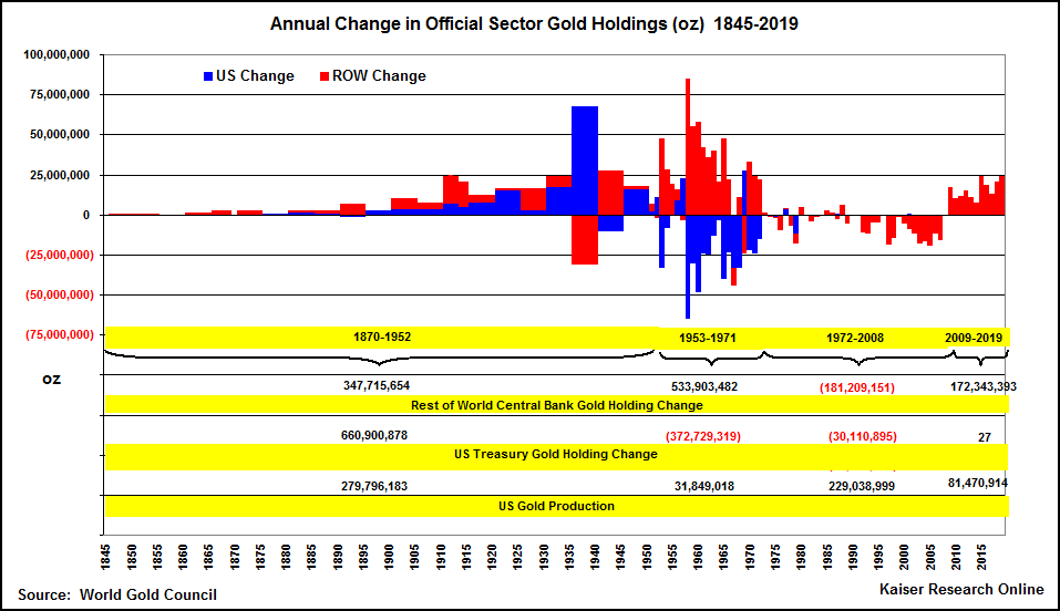
This chart tracks annual change in official sector gold holdings broken down as US Federal Reserve and Rest of World central bank holdings. The annual changes are stacked, with ROW (red) on top of US (blue). The WGC source prior to 1950 exists in 5 year increments; to accommodate an annual change we have averaged these batched increments over the number of years in the batch. The yellow bands indicate net changes for three periods, 1870-1952, 1953-1971 and 19722012. For example, during the first period the United States dominated official sector gold accumulation, ending up with 661 million oz while the rest of the world, dominated by countries directly caught up in two world wars, accumulated only 348 million oz. The bottom band presents US gold production during these periods, with the Federal Reserve acquiring 42% of its gold in the first period from domestic production (280 million oz). The rest was acquired from its own citizens and central banks whose war debts the United States bankrolled. During the post-war period until Nixon stopped the convertibility of dollars into gold ounces at $35 per oz, the Federal Reserve "sold" 373 million ounce through "conversion" while the ROW gained 554 million oz. During this period the United States produced only 32 million ounces. Since 1972 ROW central banks have liquidated net 128 million oz, most of which was sold since the mid-nineties, while the Federal Reserve sold only 30 million oz, mostly during the seventies. Since 1972 the US has produced 258 million oz, mostly from Nevada's Carlin-type gold deposits. The ROW central bank liquidation trend reversed in 2008, with net gains in each year since then totaling 54.8 million oz.
Although central banks acquired 54.8 million oz net from 2008 through 2012, there is a noticeable split between the kinds of nations who were net buyers and sellers (the United States reported itself as inactive during this period). This chart isolates the top 19 net buyers, and the top 12 sellers, with all the other central banks summed up as "others" with a very modest gain. Excluding the international agencies, of which the BIS was a net buyer while the ECB and IMF were net sellers, the buyers were dominated by emergcing economies, while the sellers were mature western economies led by France, Switzerland, Spain, Germany and the Netherlands. The large sales by Libya and Venezuela may be accounting anomalies rather than actual net sales - anybody with insights that would clarify - please contact us. What distinguishes the two groups is the net buyers belong to groups from which we can expect the greatest absolute GDP growth during the next couple decades, while the net sellers are sunset economies in the sense that while they will keep growing, they will do so at very low growth rates.
The Prosperity Argument for Gold
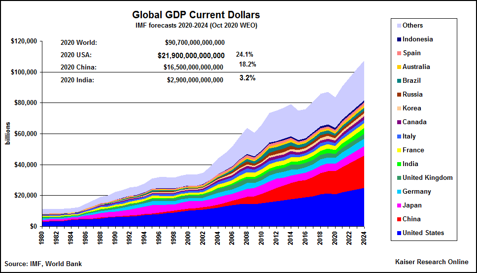
What does the above chart have to do with gold? It portrays three important trends: 1) the annual value of nominal global GDP in US dollars with IMF estimates for 2013-2018, 2) the relative share of global GDP for the United States and China, and, 3) the relative shares of total annual military spending for the United States and China (also see chart below). With the exception of the recessions in 1998 (Asian currency crisis), 2001 (dot-com bubble bust) and 2009 (real estate bubble bust), annual GDP growth has been positive, and is projected by the IMF to increase in 2014-2018 even as China's own growth rate stabilizes in the 6-8% range, down from double digit growth in the past decade. What is apparent is that although US GDP is expected to grow modestly, it is at a slower rate than for the world as a whole, while China's growth is expected to remain above that of global growth. As a result by 2018 the US share of projected $97.6 trillion global GDP will be 21.6% ($21.1 trillion), down from 21.9% ($16.2 trillion) in 2013, while China's share will rise from 12.2% ($9.0 trillion) to 15.3% ($14.9 trillion). To what extent reality will bear out the IMF's GDP growth projections, which, among other things, hinge on projected relative US dollar exchange rates, is unknown. There is currently a debate between China bears and bulls, with the bulls arguing that China will maintain a 6% plus growth rate which, because it compounds on achieved GDP, will still support super-cycle raw material demand for the rest of the decade, and the bears arguing that China is on the verge of an implosion. The debate is not about China falling to US or European growth rates of 0%-3%, because both sides generally agree that if Chinese GDP growth drops below 5%, the snowball effect would be catastrophic and the bears would prove right about the implosion.
We concede that an implosion of the Chinese economy is a risk, and treat that as the bearish outcome for gold prices in our prosperity based model because the demise of China as the world's economic growth engine for the next decade would have knock-on effects for mature western economies which are relying on a standard of living catch-up by the substantially larger Asian population to sustain the modest growth of their economies. We see a Chinese implosion as a recipe for a protracted global economic slump which constitutes a double whammy for gold demand and real prices. The first whammy is the disappearance of gold demand from buyers parlaying their new prosperity into gold as a form of wealth preservation and long term insurance. This decline will not be offset by demand from mature economies where overall prosperity growth is already muted, and negative for all but a tiny economic elite whose prosperity growth is a function of concentrating existing wealth.
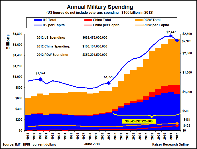
The second whammy would be the interruption of the other current trend, namely the relative increase in China's share of global military spending (9.2% in 2012) closely tied to its GDP growth while the United States struggles to sustain its disproportionate share (see chart above) of military spending (40% in 2012) while it grapples with the looming retiree Social Security/Medicare bubble and the push for ever lower federal tax revenues. China is the only credible medium term threat to displace the United States in terms of global share of GDP and military spending 10-15 years from now; a Chinese implosion would eliminate that threat, enabling the United States to maintain its status as the sole economic and military super-power even though China's demise as a global force would likely drag the United States into economic decline. With America's status as the sole military superpower and largest economy intact, the threat to the US dollar's status as the single reserve currency would diminish, and so would the incentive for both the official and private sector to accumulate gold as a hedge against the turmoil that would characterize the transition from a single reserve currency to multiple reserve currencies underpinned by balanced, competing military powers. We lean toward the view that China will avoid an implosion and will maintain GDP growth above 5% for the next 10 years while the United States limps along at modest growth rates thanks to the extreme ideological polarization that has paralyzed Washington and suspended the pragmatism that powered the United States into its position as sole economic and military super-power. We discount the argument that America's historical flair for innovation will allow it to maintain its military superiority at a decreasing cost because it is now clear that in the Internet digital age no secret is safe from cyber-theft with the results that the innovator's advantage is too fleeting to make a difference. Our prosperity based gold narrative thus predicts a higher real gold price, one that justifies exploration and development of new gold deposits, on the expectation that the continuing growth of emerging economies will generate prosperity driven demand for gold ownership, which economic growth will also destabilize the current world order where the United States is the dominant economic and military super-power. The first part explains why there will be rising demand for physical gold from emerging economies, and the second explains why there will be rising demand for gold from the citizens of the nations from whom the balance of power is shifting away.
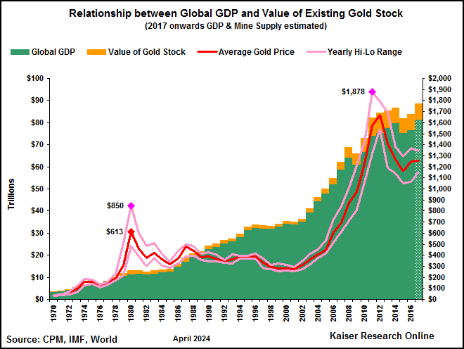
The chart above shows the relationship of annual global GDP to the value of the above ground gold stock at the average annual gold price (the yellow "gold stock value" bar on green GDP bar), as well as the average annual gold price (the red line) and the annual high and low (pink lines). Although the gold price accelerates upwards in 2003 in conjunction with global GDP growth, there is no obvious relationship between the price of gold and the size of the global economy. Gold bears, who are frequently optimistic about the global economy, see only the exponential chart pattern for the gold price, and base their predictions of a return below $1,000 on the bubble principle that "what goes up must come down".
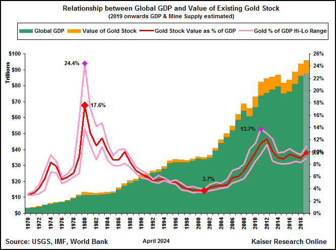
While it is hard to imagine a linkage between the size of the global economy and the price of gold, that the value of all the gold that exists above ground, namely 172,500 tonnes of 546 million ounces by the end of 2013, may have some relationship to the value of the global economy, is intuitively plausible. The rationale for assuming such a relationship resides in the historical practice of individuals and states using gold as a repository for accumulated wealth. Since the exchange of goods and services constitutes the creation of value and thus wealth, and the US dollar based exchange rates are used to measure that value, just as is done with the above ground gold stock through the USD based gold price, it makes sense that the value of the gold stock would track the value of the global economy in some manner, with the gold price adjusting for new annual mine supply if such rises at a greater rate than the global economy. In the chart above we have plotted the annual value of ther above ground gold stock as a percentage of nominal GDP (not adjusted for inflation because we assume that over time the price of gold implicitly adjusts for inflation). Looked at from this perspective gold does not at all look like it is in a bubble, especially compared to 1980 when the $850 peak made the 100,800 tonnes or 3.2 billion gold ounces worth 25.7% of global GDP. In contrast, at the London PM Fix peak of $1,877.50 in 2011 at the end of which the gold stock totaled 169,800 tonnes or 5.5 billion ounces, the value of the gold stock represented only 14.4% of global GDP, just over half the peak achieved in 1980. During the volatile year of 2013, the gold stock value has ranged from a low of 8.9% at $1,192 per oz to a high of 12.7% at $1,693.75 per oz. So what do we make of the gold stock value's long decline from 1980 until bottoming at 3.9% of global GDP in 2001? Central bank liquidation and the surge in new mine supply made possible by gold's 419% real price gain between 1972-1980 partly explain the decline of the gold stock value relative to GDP, but one should not forget that gold is not just a way to store wealth. Gold is also a medium which absorbs stress, both at the personal level when one fears the evaporation or confiscation of value stored in savings, property title and businesses, and at a global scale when international turbulence threatens the status quo be it in the form of financial, political or economic stability. The period from 1978-80 had a number of stressors that included runaway inflation in the west, the American humiliation in Tehran, and Soviet aggression in Afghanistan. During the eighties these problems disappeared, with the United States winning the Cold War to become the unchallenged sole economic and military super-power whose military budget guaranteed globalization. The unforeseen consequence of America's Cold War victory was the widespread adoption of free market capitalism with a big government twist by China, the most populous nation in the world which had slogged nowhere under the yoke of Mao Zedong's brand of communism. Not only did the China driven economic boom drive up GDP, but it also generated a new discourse that suggested if China continued to grow its economy, it would by 2030 over-take the United States as the biggest economy. Given that the Chinese Communist Party remains obsessed with remaining in charge (see Seven Perils, the prospect of China being able to project power globally at the expense of the United States serves as a new stressor, albeit of a subtle nature. For a couple realistic assessments about potential futures see Global Trends 2030: Alternative Worlds published by the National Intelligence Council in December 2012, and Gold, the renminbi and the multi-currency reserve system produced in January 2013 by the OFMIF on behalf of the World Gold Council. It is our view that the value of the gold stock is in part a reflection of systemic "big picture" anxiety which we believe will remain at elevated levels for the next decade as long as China and other emerging nations stay on an economic growth track that exceeds GDP growth rates achievable by Europe, Japan and the United States. The combination of physical gold being packed away as emerging nation prosperity rises while structural anxiety encourages others to shift more of their existing wealth into gold is what will support higher real gold prices during the next decade.
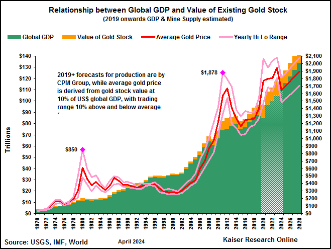
Assuming that indeed there is a relationship between the value of the above ground stock and the size of GDP, we can project a price for gold using GDP and gold mine supply projections by assigning a "stress" value that represents the ratio between the value of the gold stock and GDP. In the chart above we have used the USD GDP projections published by the IMF in its April 2013 World Outlook and the 2013-2016 mine supply projections published by CMP in its 2013 Gold Book. If we use 10% as a medium term "stress" value, we would see gold average $1,379 in 2014, $1,431 in 2015 and $1,514 in 2016 (the red line, the pink line reflect 10% annual volatility). This sort of trading range over the next couple years would not generate a bull market for gold equities, especially given that the global all-in cost is estimated at about $1,200 per oz, but it certainly is a better outcome than implied by sub-$1,100 price predictions by certain investment banks and America-centric black-box pundits. It is important to note that CPM sees additional new mine supply peaking at 7.9 million ounces in 2014, and dropping off to 4.4 million in 2015 and 3.8 million in 2016. These figures were published before the April 2013 gold smackdown, and will likely be revised downwards if gold does not claw its way back above $1,600. It should be noted that under this gold price model a decline in production due to rising production costs and depletion of mines would result in higher gold prices if the stress factor is held constant and GDP materializes as projected. It should also be noted that if the US dollar undergoes a substantial decline against all other currencies, namely the selective USD currency debasement that the apocalyptic gold narrative warns about, and this does not have a dampening effect on the exchange of goods and services around the world, global GDP denominated in US dollars would rise. And because this would not increase the projected size of the gold stock, we would see this US dollar decline translate into a higher gold price. And if the world undergoes collective currency debasement so that exchange rates remain relatively stable, the resulting inflation would translate into higher figures than projected by the IMF, provided such inflation does not have a chilling effect on the global economy. In this sense our prosperity based pricing model for gold is not really an alternative to the apocalyptic gold narrative, for it incorporates the predicted consequences of fiat currency debasement or hyper-inflation. We think our prosperity model is superior to the apocalyptic model because it provides a foundation for predicting the higher real gold prices that are the key to higher profitability for existing gold mines, the economic justification for developing existing deposits, and the impetus for exploration that targets gold mineralization at a lower cutoff than historically feasible to mine.
The wild card, of course, is the stress variable, which will be a function of perception and expectations over time. The 10% level is about 40% of the peak in 1980. We think it is conservative given the uncertainties that face us in all arenas. In the chart above we have included what happens to the price of gold if the 1980 stress variable peak of 25.7% returns, as well as the 3.9% "calmness" that prevailed in 2011 before the 911 terrorist attack. Clearly the price of gold could end up all over the map. We think it is completely wrong to describe gold as a "safe haven" in the sense that if you own gold you will never lose your claim to the wealth you currently possess. Gold is only one part of a hedge, and if you only own one part of a hedge, you have a simple naked bet that can help or harm you in a big way. Our goal at KRO is to use the gold exploration, development and mining equities as vehicles for leveraged bets on gold, which is why we are very interested in what might create higher real gold prices, and not so much in higher nominal gold prices driven by inflation or US dollar exchange declines which are always accompanied by offsetting cost increases that do not boost the economic value of a gold deposit or mine.
Gold Supply
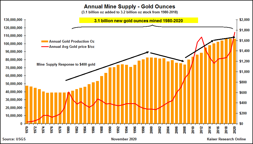
Supply evolution chart since 1980 ordered according to 2012 ranking, based on USGS estimates.
The pie chart for 2012 gold production estimated by the USGS shows that China dominates with 14% of 86.8 million ounces produced in 2012, followed by Australia, the United States and Russia, with South Africa, once the dominant producer by far, at just 6%. The biggest question is the sustainability of Chinese gold production, which does not come from a handful of very large mines as is the case in Australia, the United States and Russia.
USGS estimates about global gold reserves, ounces in the ground supposedly economic to mine, have China in ninth place at 4%, which would suggest that China's ability to maintain current production is doubtful. South Africa's second place position at 12% is mis-leading, because although the Witwatersrand Reef has extraordinary gold resources, these are at levels much deeper than historically mined, and unless there is a substantial real increase in the price of gold that allows these ounces to be mined safely underground, much of them are likely uneconomic.
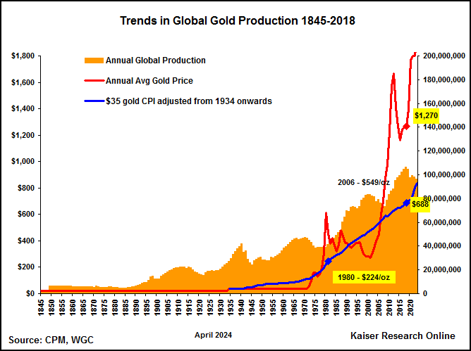
Much ado is made about the bubble like optics of the gold price chart, with comparisons made to gold's run-up to $850 in 1980 from $35 per oz less than a decade earlier. The suggestion is that after peaking at $1,921 in August 2011, gold will stabilize at a similar level 50% from the peak as happened during the eighties, following which gold was effectively in a 20 year bear market during which gold substantially under-performed treasury bills. The comparison, however, is misleading, because in 1972 gold had spent 40 years artificially priced at $35 per oz through a sort of "gold standard" that can be viewed as the antithesis of free market principles. This long-running act of government price control forced the mining industry to gear all its gold exploration and development efforts towards a $35 gold price. That worked fine during the thirties after Roosevelt increased gold's "official" price from $21 to $35, a 67% real increase, in a depression setting of falling costs while gold prices were fixed. But during the inflation of the ensuing 40 years the rising cost of gold production turned low hanging fruit into high-hanging fruit that discouraged gold production except in places like South Africa where the richness of the Witwatersrand gold field coupled with apartheid policies that enabled the producers to use black miners as expendable labor created a bounty of profitable gold production.
When Nixon released gold from its big government shackles in 1972, and gold promptly tripled in price, the mining oindustry was slow to respond, possibly because now the miners have had to contend with two independent variables, an unpredictable market price for gold and the cost of production, which during the seventies suffered OPEC-induced inflation that it turn unleashed cost-push inflation. Gold production growth did not turn positive until 1980 when gold peaked at $850, and a new industry of $3,000 gold prediction was born.
While the predictions of $3,000 gold never materialized, the novelty of gold as a commodity with a free market determined fiat currency price and the fact that gold has no intrinsic value other than the marginal cost of production did encourage the mining industry to take advantage of $400 gold, which represented a CPI-adjusted real gain of 419% from $35 in 1970. While this gain was much more impressive than the 67% delivered by Roosevelt in 1934, from 1934-1970 the CPI adjusted price of $35 gold was $101.48, which means the real price increase was about 294%. That was still a substantial repricing, and the mining industry responded with gusto, adding 2.2 billion new gold ounces to the estimated existing 3.2 billion oz gold stock as of 1980 between 1980-2012. What had been previously ignored as very high hanging fruit was suddenly recognized as very low hanging fruit, helped out by new extraction and exploration technologies. This new mine supply, plus sales from the official sector which reduced its holdings by 12% from 1980-2012, had to be absorbed by the private sector. And since gold ultimately delivers its value to its owner only when the gold is exchanged for something with utility, it is no surprise that gold ended up stuck in a two decade price bear market.
Gold's rise to $1,921 since 2002 and recent decline look similar to what occurred during the seventies, encouraging some to predict a full 50% retrenchment from the peak price to a level around $950-$1,050 per oz, but in terms of the low-high hanging fruit metaphor, the situation is very different this time around. As the chart below shows, while Federal Reserve Chairman Paul Volcker may have tamed runaway inflation, inflation did not disappear. In fact, $400 gold CPI adjusted to the present would be $1,118 per oz, close to the price targets of gold bears such as Societe Generale and Goldman Sachs. But what this chart also reveals is that if we apply the 10% annual mining cost escalation that prevailed from 2007 onwards to the $1,007 average gold price in 2007, the real inflation adjusted gold price would be $1,622 per oz. At ordinary CPI a spot price of $1,330 per oz represents only a 19% real gain from 1980, which pales against the 233% nominal price gain. What the gold bears do not take into account with their pessimistic long term predictions of $1,000 gold is the fact that the 2.2 billion ounces of new gold mined since 1980 represents serious depletion of the low hanging fruit created in 1980 by gold's 419% real price gain from $35. Not only are mining sector costs higher, but the remaining in-ground gold stock is of a lower grade, metallurgically more complex in many cases, and located in geolopolitically or infrastructurally challenged locations. If estimates that the average global all-in cost of gold production is running at $1,200 per oz, the prediction that gold will stabilize below $1,200 per oz is to make one of the following arguments: 1) there will be an energy breakthrough that slashes the cost of gold production and unleashes a tsunami of new supply as happened between 1980-2012, 2) both the official and private sector will develop a distaste for gold that translates into widespread liquidation, or, 3) there will be a global depression that reverses the broadening prosperity growth trend of the past couple decades which forces gold owners to swap the luxury of gold ownership for the utility of goods and services. The first two are unlikely, but the last is a distinct possibility.
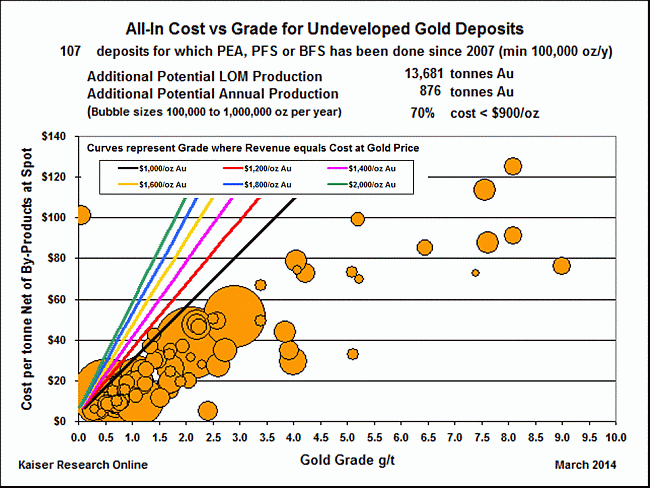
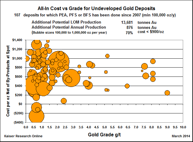
The gold cost versus grade charts feature primary gold projects generated by the resource juniors which are either still at the feasibility demonstration stage or are being developed as gold mines. The colored lines in the cost/tonne vs grade chart above reflect the recoverable grade at which the all-in-cost per tonne would match the rock value of the ore at the stipulated gold price. In other words, you want your deposit to sit to the right of the line which you believe represents the long term price for gold. Only deposits capable of producing 100,000 oz or more annually are featured in the charts.
Gold Deposits
KRO tracks the 43-101 resource estimates published by junior companies as well as the annual reserve reports of the major producers. The links below relate to ordered lists where gold is the dominant metal in a deposit and where gold is simply present. The figures in the list represent the ounces attributable to the company through its net interest in the project. The actual resource estimate shows up in the project section of the company's profile. A significant value added by KRO is to present the per tonne rock value and gross metal value of the deposit using spot and 3 year average prices on a 100% recovery basis unless specific metal recoveries have been provided by the company. We also calculate the percentage each metal contributes to the deposit's value. The mining industry likes to use three year trailing average prices for metals to smooth out short term fluctuations, provided that average price is lower than the spot price. When the price boom subsides, as has happened with gold in 2013, and the trailing average ends up higher than the spot price, nobody knows what prices to use in economic valuations. The chart below portrays trailing averages from ten years to one year for gold based on the London PM Fix.
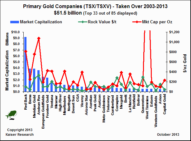
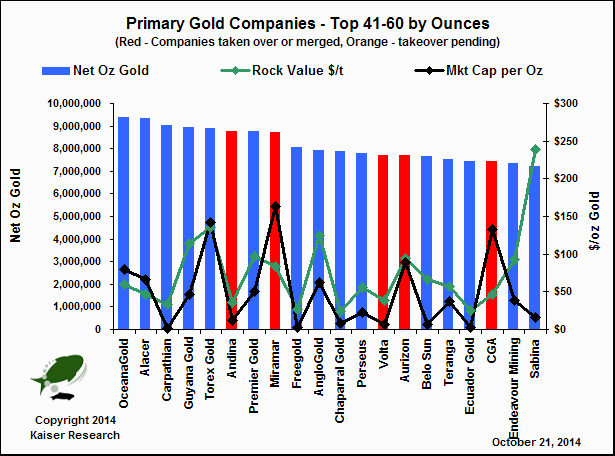
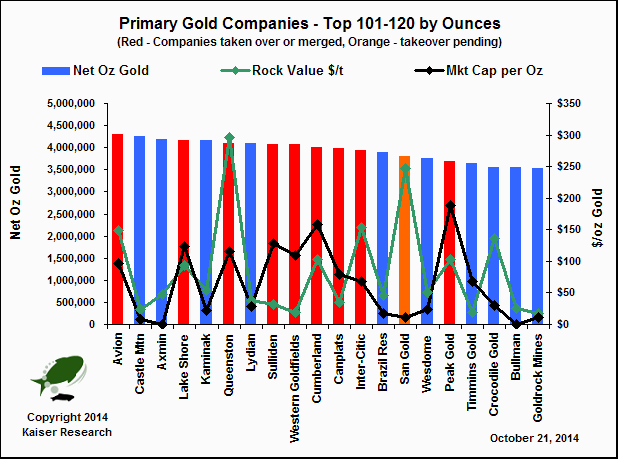
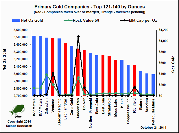
The period 2003-2013 saw 85 resource juniors producing or developing gold dominated deposits disappear through takeover bids or mergers with much larger companies worth $51.5 billion. The KRO gold resource tables (KRO members only) are littered with companies that no longer exist. The chart above lists the top 33 companies ranked by market capitalization at the time of their takeovers. The charts below rank companies by net ounces, with taken over companies flagged as red while those with pending takeovers flagged orange. To see the details KRO Members can click the resource table links for the ranking of their choice.
KRO Resource Tables - Members Only
Gold (Dominant- more than 50% of gross metal value attributable to gold at spot)
Sorted by market capitalization. Minimum 100,000 net oz.
An example excerpted from the Gold Dominant Resource Size ordered list is presented below. The red companies are those which have been taken over. These resource tables are an efficient way to screen for projects within parameter ranges. The alphabetical lists include a breakdown by project. The Projects Only by Resource Size report lists the deposits in order of resource size (keep in mind these are net to the company). See our Resource Estimate Index for a complete list of metals for which we provide ordered reports.
Excerpt from Project Resources: Gold - Resource Size (Gold Dominant)
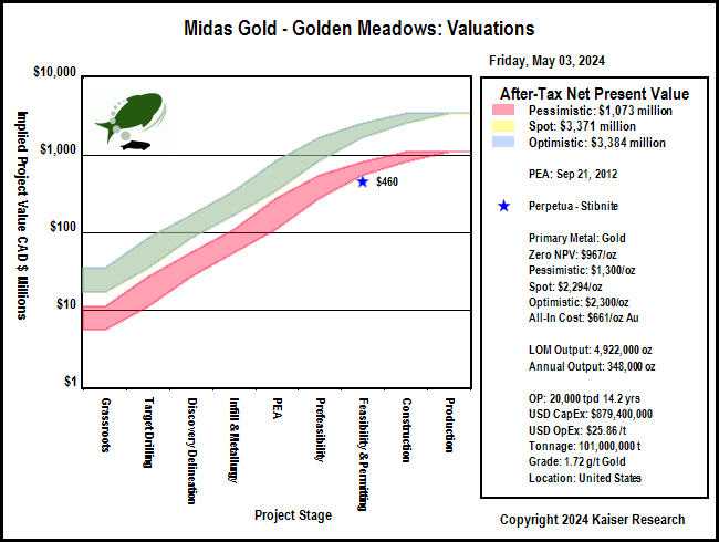
The company name is a link to the company profile which contains details about the resource estimates. The example below is for the Yellow Pine deposit within the Golden Meadows project of Midas Gold. The rock value ($/t) and in situ value are updated daily using current spot and 3 year average metal prices.
Project Resource Estimate - Golden Meadows - Yellow Pine
3 Year Average: Gold $1,541.99/oz, Silver $30.03/oz, Antimony $5.88/lb
Economic Studies
KRO has compiled in a "life-of-mine average" form the details of all the 43-101 economic studies published by the resource companies (PEA, PFS, FS). These have been presented in a variety of sort orders available through links on our Economic Project Studies Index page. The links below relate to projects where gold is the primary metal. The reports are restricted to KRO members.
Sensitivity Charts for all current project studies sorted alphabetically by company name. By-Products priced at spot. Chart is link to study details within KRO company profile.
Sensitivity Charts for all current project studies sorted by NPV in descending order. By-Products priced at spot. Chart is link to study details within KRO company profile.
Sensitivity Charts for all current project studies sorted by LOM gold output in descending order. By-Products priced at spot. Chart is link to study details within KRO company profile.
Sensitivity Charts for all current project studies sorted by average gold grade in descending order. By-Products priced at spot. Chart is link to study details within KRO company profile.
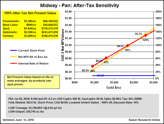
The above lists contain two charts for each economic study. The example below is for the PEA completed by Midas Gold on September 21, 2012 for its Golden Meadow project. The first chart tracks the after tax sensitivity of the mining plan to various prices for the primary metal ranging from pessimistic to fantasy. The chart includes a snapshot of the study parameters and a graph showing the NPV and IRR. It is also a link to the economic study section for that project in the company's profile. In order to facilitate comparison between economic studies we have reduced the study's parameters to life of mine averages, applied a common tax regime to all the studies, and assigned spot metal price to the payable by-product metals. These economic study charts are thus an approximation and intended only as a guide to help focus more detailed research by KRO members. The second chart plots the implied value of the Golden Meadows project on a 100% ownership basis as defined by the company's stock price, fully diluted shares and net project interest. The three colored bands represent the after-tax NPV generated by the pessimistic, spot and optimistic prices we have assigned to gold. They serve as the fair value channels as defined by the uncertainty ladder used in our Rational Speculation Model, which discounts the value of the potential outcome based on the stage of the project. The implied valuation chart allows one to see whether the market's pricing of the company represents poor, fair or good speculative value relative to the ultimate net present value generated by different gold prices.
Gold Usage
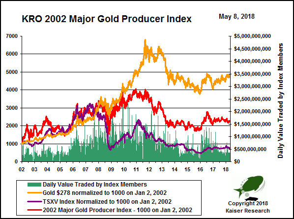
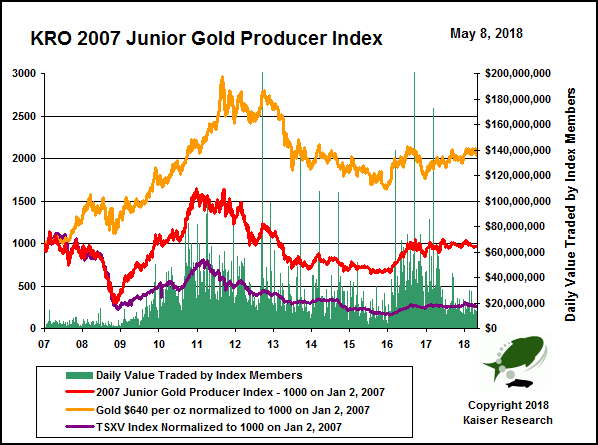
KRO Gold Producer and Developer Indices
KRO maintains six current indices related to Canadian listed gold producers and non-producers with advanced gold deposits in an effort to track how these companies are faring as a group as well as how each company is performing relative to other members of its index. The index construction method is simple: all companies eligible for membership in an index as of the effective date are assigned a uniform $1,000 weight which gets converted into the number of shares that can be bought at the closing price on the effective date. The starting value of the index is 1000, in effect the average value of its members. Each day going forward the index value is calculated on the basis of the closing value of the index member positions. When a new member achieves eligibility, it gets added at the value of $1,000. Companies that get taken over remain frozen in the index at the last trading price; companies that lose their eligibility also remain in the index at the value on the date they lost eligibility. We also back-calculate each index a couple years from the effective date to show the group's history, which is pretty interesting for the 2013 indices. The back-calculation is done for each member up to the date where it achieved membership eligibility.
The chart above is an example of the individualized chart created for each company that is a member of an index. In the example it is Midas Gold Corp, which was eligible for the 2013 Major Non-Producer Index when it commenced trading on July 14, 2011 by virtue of having a net gold resource in excess of 3 million ounces. The blue line represents the daily value of the 1,111 shares assigned to Midas based on its $0.90 closing price on July 26, 2013, the effective date of this index. The red line is the index itself. In this example it is clear that Midas Gold's price performance closely tracks that of the index. The yellow line represents the price of gold which was normalized to 1000 at its closing price on July 26, 2013. Note the relatively flat performance of gold since the start of 2011 compared to Midas and the Major Non-Producer Gold Index as a whole. The green bars represent the value traded by Midas each day as a percentage of the total value traded by all the members of the index. The 40 Day Index Over/Under Performance chart below reflects the percentage by which the company's index value increased or decreased beyond that achieved by the index as a whole. A run of green or red bars indicates that something specific to the company rather the behavior of gold was driving market action during those periods.
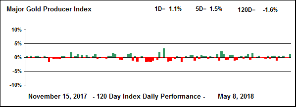
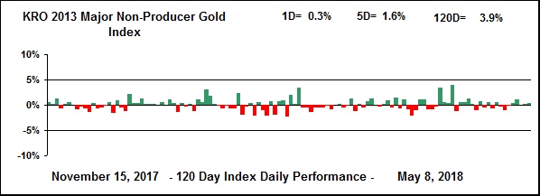
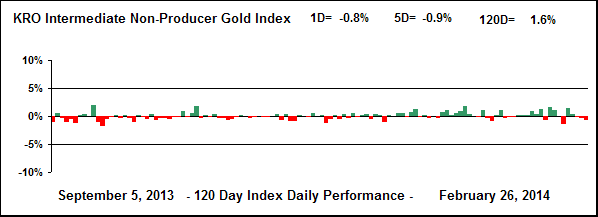
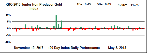
Each of the index charts below is also a link to a KRO web page that includes a table listing the member positions and the current weighting within the index, a table with end of day market activity, and a segment for each index member that includes the individualized index and 40 day over/under performance charts, a stock price chart, and a brief synopsis of the company's story. These consolidated index pages are restricted to KRO members only. The 120 day index daily performance charts indicate the percentage the index was up or down each day. Although you can discern such trends simply by looking at the index chart, this specialized chart highlights recent setbacks and rallies as well as their reversals. For a list of other indices we maintain, see KRO Theme Indices.
The KRO 2002 Major Producer Gold Index effective January 2, 2002 includes companies listed on a North American exchange which are primarily gold producers that produce in excess of 500,000 oz annually. It currently has 13 active members and 2 inactive members that were taken over.
The KRO 2002 Intermediate Producer Gold Index effective January 2, 2002 includes companies listed on a North American exchange which are primarily gold producers that produce between 100,000-500,000 oz annually. It currently has 19 active members and 13 inactive members that were taken over.
The KRO 2007 Junior Producer Gold Index effective January 2, 2007 includes companies listed on a North American exchange which are primarily gold producers that produce between 25,000-100,000 oz annually. It currently has 30 active members and 14 inactive members that were taken over.
Non-producing companies primarily involved in the exploration and development of a gold project. Index eligibility occurs when the company reports a net gold resource in excess of 3 million oz whose GMV represents more than 50% of the total GMV in a dual metal resource, and more than 40% of the GMV in multi-metal resources. Companies which are index members and commence commercial production stay in the index. Due to the large number of taken over companies, this index is superseded by the KRO 2013 Major Non-Producer Gold Index which includes only active listings effective July 26, 2013. Although now discontinued, because this index was effective January 2, 2003, it provides a good review of how the juniors performed during the 2003-2013 gold boom.
Effective July 26, 2013 replaces the Major Non-Producer Index which had an effective date of January 2, 2003. It includes companies primarily involved in the exploration and development of an gold project. Index eligibility occurs when the company reports a net gold resource in excess of 3 million oz whose GMV represents more than 50% of the total GMV in a dual metal resource, and more than 40% of the GMV in multi-metal resources. Unlike the discontinued index, companies which are index members and commence commercial production are frozen in the index at the price when commercial production is announced.
Company is primarily involved in the exploration and development of an gold project. Index eligibility occurs when the company reports a net gold resource in the range of 1-3 million oz. Companies which are index members and commence commercial production or graduate to the Senior Non-Producer Index stay in the index. Due to the large number of taken over companies, this index is superseded by KRO 2013 Intermediate Non-Producer Gold Index which includes only active listing effective July 26, 2013. Although now discontinued, because this index was effective January 2, 2003, it provides a good review of how the juniors performed during the 2003-2013 gold boom.
Effective July 26, 2013, features non-producing companies primarily involved in the exploration and development of an gold project, with the gold content exceeding 50% of the overall GMV in the case of multi-metal deposits. Index eligibility occurs when the company reports a net gold resource in the range of 500,000-1,000,000 oz. Companies which are index members and commence commercial production or graduate to the Intermediate Non-Producer Index are frozen in the index.
Company is primarily involved in the exploration and development of an gold project. Index eligibility occurs when the company reports a net gold resource in the range of 500,000-1,000,000 oz. Companies which are index members and commence commercial production or graduate to the Intermediate Non-Producer Index stay in the index.
Effective July 26, 2013, features non-producing companies primarily involved in the exploration and development of an gold project, with the gold content exceeding 50% of the overall GMV in the case of multi-metal deposits. Index eligibility occurs when the company reports a net gold resource in the range of 500,000-1,000,000 oz. Companies which are index members and commence commercial production or graduate to the Intermediate Non-Producer Index are frozen in the index.


![[Most Recent Quotes from www.kitco.com]](http://kitconet.com/charts/metals/gold/t24_au_en_usoz_2.gif)